Design for Developers
Intro
I’m a believer that anyone can build anything, given that they stay resourceful. Development, design, product all require similar veins of thinking. You need to think from the user’s perspective, continuously iterate, and collaborate cross functionally. Generalists who are able to do a bit of everything, or at least understand the tools of other trades have a great advantage in the industry.
Back in 2016, I was a self proclaimed iOS developer. I knew how to build these simple apps, but didn’t know anything about design. That design bit was holding me back. I was afraid to start a new project until I had carefully produced mockups, and a clear understanding of what to build. This mindset held me back from doing the most important thing — building.
Taking the leap is really important. It means recognizing that you might not immediately have all the skills necessary to do something, but that you’ll give it a try anyway. When it comes to a developer learning how to design, taking that first leap is critical. After all, design skills don’t come through books or videos, but through application and reflection.
It’s definitely intimidating to dive into a field you’ve never explored before, but there are ways to make that transition easier. In this next section, I’ll talk a bit about some small things that have helped me be more resourceful and soak in knowledge from unexpected places.
How to be resourceful
Question your friends a lot.
It’s easy to fall in the trap of the false consensus effect, where we believe everyone sees things the same way we do. But the fact is, those around us, even those closest to us, probably perceive things very differently. That’s something people should exploit; it’s a free resource that’s incredibly accessible to us.
When unsure about how you’d approach a problem or novel idea, ask a friend. They don’t need to be an expert in that field — in fact, I think it’s better if they weren’t an expert. Get their opinion on how they would design a search box, then make adjustments as you see fit. Others’ unbiased approaches to a problem, or their years of expertise can teach you a whole lot.
Question seemingly inconsequential things in your daily life.
This is a big one! Every time you use a mobile app or visit a landing page, don’t just mindlessly scroll through. It’s pretty crazy, but most of the times everything is meticulously crafted, with elements placed in certain locations for very specific reasons. Put yourself in the shoes of the person who designed that product, and think about a few things: Why choose this color for their buttons? Why use certain fonts? Why use this style of wording? Why this graphic style?
Get good at searching for answers
Here, I pretty much mean get really good at digging through Google, Reddit, and relevant forums. There are countless blog posts, videos, and threads that go really deep into even the most obscure things. If you look hard enough, you’ll find an answer, or at least another direction to look in. Searching for help instead of thinking through already solved problems and reinventing the wheel is a much better use of time.
Get connected
Follow blogs, newsletters, YouTube channels, Twitter accounts, whatever pertains to what you’re trying to learn. Become a daily follower of a few channels. r/design and UX Collective on Medium are always great sources for learning from other designers. I also tend to scroll through ProductHunt every morning, paying special attention to what makes successful products so usable/beautiful, and what problems plague less successful products.
For developers looking to learn design, here are a few resources I found super helpful.Mobbin.design: mobile design inspirationPttrns.com: mobile design inspirationDribbble: general design inspirationMuzli: general design inspirationLapa.ninja: landing page inspiration
A few rules of thumb
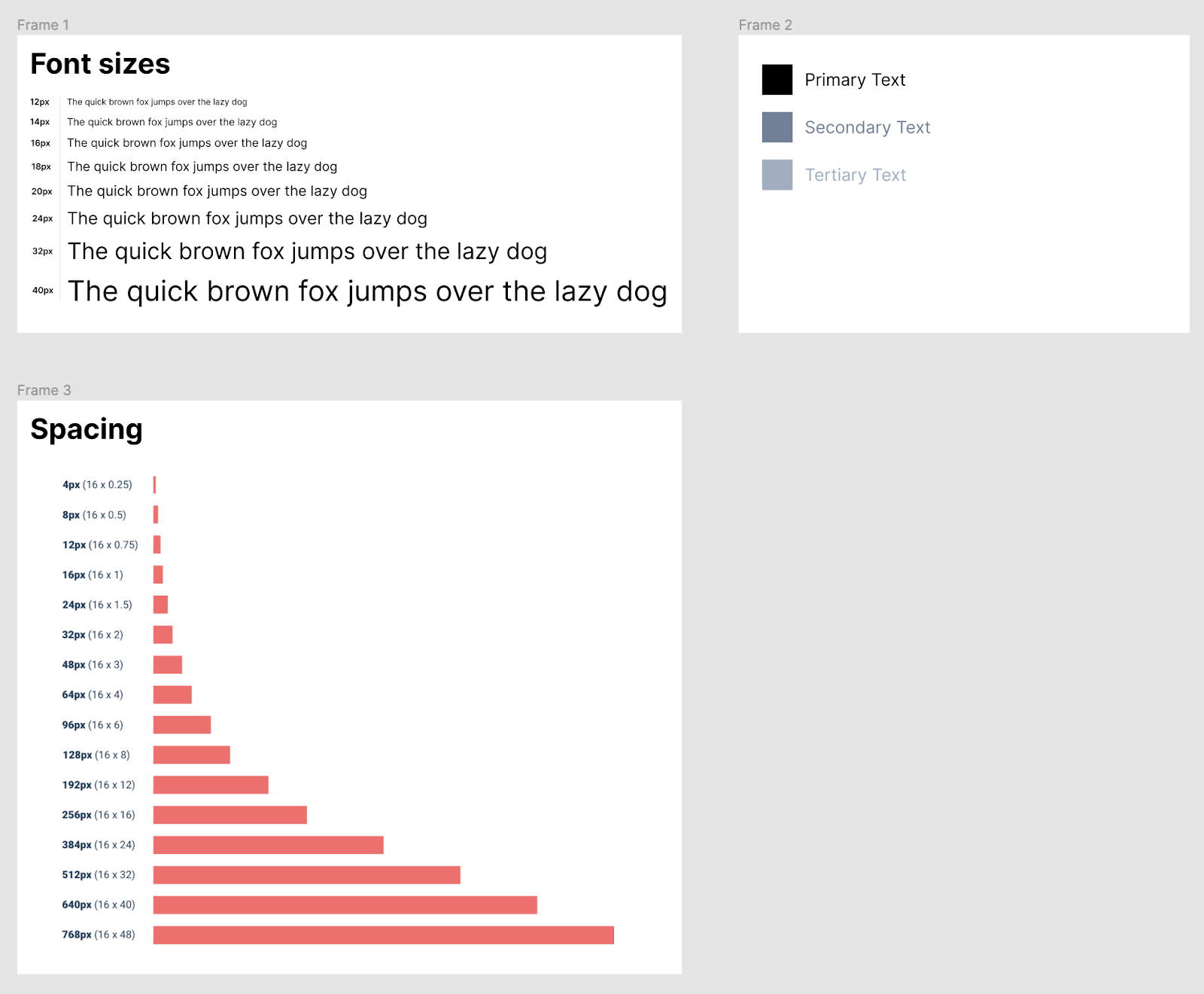
Establish a design system early onInvesting some initial time to develop a design system saves a boatload of time down the road. Here’s an example of a basic design system. It consists of setting up font sizes/styles/colors, spacing rules, and a color palette. As you add to this system, you can build out reusable components like modals, buttons, and call to action blocks.
Or, if you don’t want to build a design system from scratch, use a framework like Tailwind CSS or Bootstrap which gives you a set of components out of the box.
Want even more customizability? Run with a prebuilt design system like Blueprint by Palantir or Evergreen by Segment.
Make sure to reference this system constantly as you start developing! It keeps your design clean and consistent.
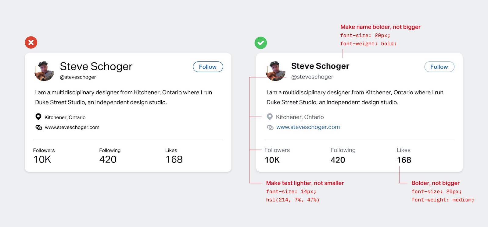
Hierarchy This one’s super important! Not all elements on the page should be treated as equal. Bump up the font size and weight for the elements that users should care more about. Typically, section titles, important statistics, or names take precedence over body text, descriptions, and metadata. Another tip from Steve Schoger from Refactoring UI (highly recommended read): you can establish hierarchy not just from increasing the font sizes, but primarily through font weight as well. Sometimes, keeping elements scaled down with larger weights helps a lot with balancing the aesthetics of a page.
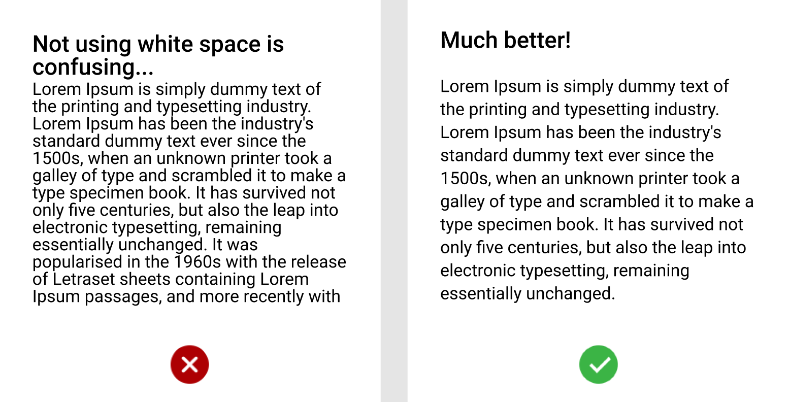
Use white space
White space is a powerful tool. It can be used to draw attention where you want, increase legibility, and add a sense of additional organization and hierarchy to the page.
White space in Google’s homepage here removes distractions and draws your attention to what matters — search.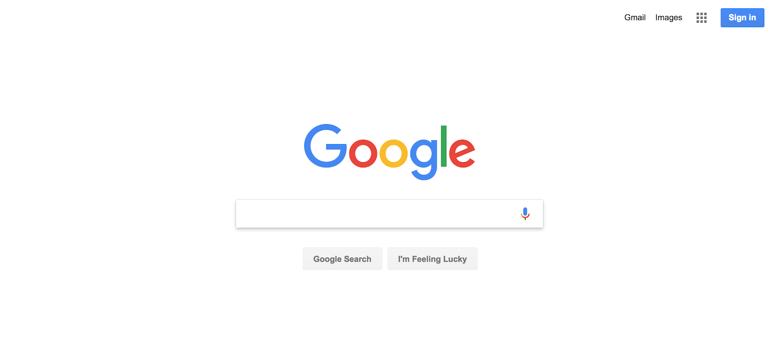
Utility over design
We learned a few tips to freshen up your UI design, but the most important thing to keep in your mind is to always prioritize utility over design. Something beautiful that people don’t understand just isn’t useful to anybody.
Choose a traditional font for your body text. I love Inter, Helvetica, PT Serif if you want a sans serif font. They’re clear and legible. Make sure there’s enough foreground and background contrast. Make sure text is clearly visible, and think about accessibility when it comes to people who might have some form of colorblindness. Here’s a pretty great tool to see if your colors have enough contrast: Contrast Checker

Roland Shen
I'm Roland, developer and designer from Los Angeles. Currently, I work at Ramp as a growth engineer. Previously, I was at Coinbase, where I worked on the transfers team responsible for fiat / crypto transfers.